
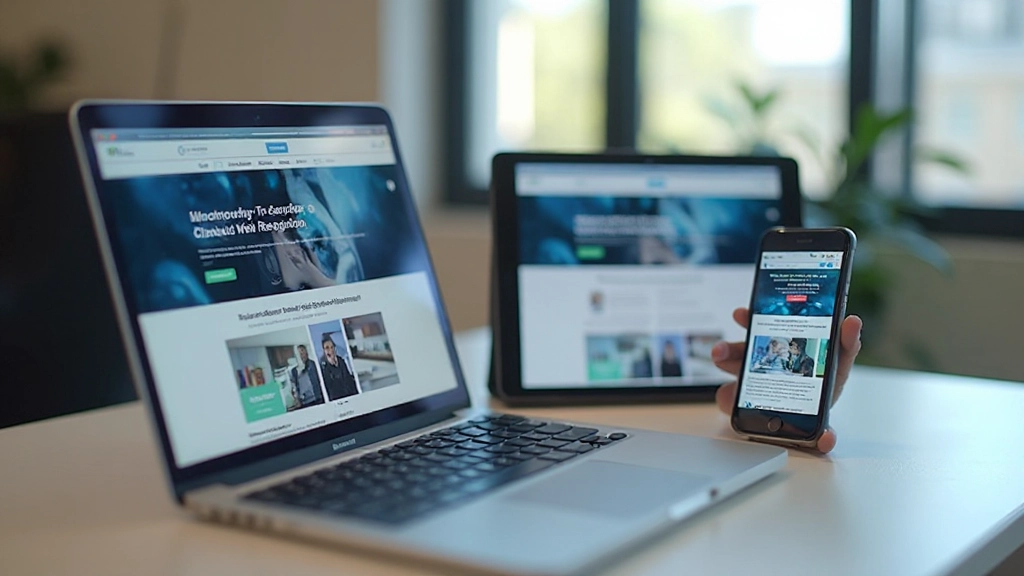
Starting With Mobile: Why It Actually Changes Everything
How designing for small screens first forces better decisions about layout, content hierarchy, and feature prioritization.
A practical breakdown of how media queries work, where to set your breakpoints, and common patterns that work well for most projects without overcomplicating things.
When you’re building a website that needs to work everywhere, media queries are your foundation. They’re not fancy or complex — they’re just CSS that says “when the screen is this wide, apply these styles instead.” But here’s the thing: most developers overthink breakpoints. They add too many, chase every device size, and end up with unmaintainable code. The truth? You probably only need three or four solid breakpoints to handle 95% of real-world usage.
This guide walks you through exactly how media queries work, how to choose your breakpoints intelligently, and the patterns that actually make a difference. We’ll skip the theory and focus on what you can implement today.

A media query is just a conditional statement in CSS. It says “apply these styles when this condition is true.” The most common condition is screen width, but it can be much more. You’re essentially asking the browser: “Is the screen at least 768 pixels wide? If yes, make the sidebar 25% instead of 100%.”
The syntax is straightforward. You write
@media (min-width: 768px) and everything inside
that block applies only when the condition matches. The browser
checks this constantly as you resize the window or rotate your
device. It’s reactive — it responds to changes in real time.
What makes this powerful is that you’re not creating separate stylesheets or different HTML. It’s all one file. One source of truth. Your mobile styles are right there next to your desktop styles, so changes are obvious and updates are simple.

Here’s where people go wrong. They see a chart showing every possible device width — 320px, 375px, 414px, 768px, 1024px, 1440px, 1920px — and they think they need a breakpoint for each one. You don’t. That path leads to 20+ media queries and maintenance nightmares.
Instead, think about your layout. Where does it actually break? When does single-column become two-column? When does the navigation stop fitting? Most projects work perfectly fine with just three breakpoints: mobile (base), tablet (around 768px), and desktop (around 1024px). Some sites only need two. Rarely do you need more than four.
These numbers aren’t magic. You pick them based on your actual content. If your headline looks good up to 800px, then 768px makes sense. If you need more breathing room, push it to 800px. The key is testing on real devices or at least using your browser’s responsive tools to watch where things break.

Once you’ve picked your breakpoints, you’ll notice patterns repeating. These aren’t coincidences — they’re the solutions that have worked for thousands of projects. Understanding them saves you from reinventing the wheel.
On mobile, your sidebar goes below the main content. On desktop,
it sits to the side. Simple flexbox with
flex-direction: column on mobile, then
flex-direction: row at your tablet breakpoint. Your
main content takes up more width, the sidebar stays narrow. This
works for blogs, dashboards, documentation — everywhere.
You’ve got three product cards across on desktop. On tablet, it
becomes two. On mobile, it’s one per row. Use flexbox with
flex-wrap: wrap and adjust the flex-basis at each
breakpoint. No complex grid needed. At mobile you might set
flex-basis: 100%, at tablet
flex-basis: calc(50% - 1rem), and at desktop
flex-basis: calc(33.333% - 1rem).
Desktop navigation with multiple links becomes a hamburger menu
on mobile. You don’t need JavaScript for basic showing and
hiding — use display: none on mobile and
display: flex at your breakpoint. The hamburger
icon reverses: display: flex on mobile,
display: none on desktop.

You’ve got your breakpoints picked. Now comes the actual work. Here’s what separates clean, maintainable code from the kind that makes you regret opening the file six months later.
Start mobile-first. Write your base styles for the smallest
screen, then use @media (min-width: 768px) to add
complexity as screens get bigger. This keeps your CSS lighter on
mobile and makes logical sense — you’re building up, not tearing
down. It also forces you to think about what’s truly essential
versus what’s nice-to-have.
Use consistent naming for your breakpoints. Don’t have one breakpoint at 768px and another at 750px. Pick your three or four and use them everywhere. Some teams define them as variables or in a separate file. That way, if you ever need to adjust, you change it in one place.
Test on actual devices when you can. Browser preview tools are great, but a real phone feels different. Fonts render differently. Touch targets matter. If you’re testing at 375px on your monitor, it’s not the same as holding a 375px phone in your hand. Even testing on a couple of devices catches issues that preview tools miss.
Watch your font sizes. What reads well at 16px on mobile might
be too small at 14px on a 27-inch desktop. Use
clamp() for fluid sizing — it scales smoothly
between breakpoints without needing multiple media queries for
typography.

Media queries aren’t complicated. They’re straightforward conditional CSS that responds to screen size. You don’t need to chase every possible device width. Pick three breakpoints that match your actual layout needs. Use the patterns that everyone else uses — they’re proven because they work. Start mobile-first, test on real devices, and you’re most of the way there.
The best responsive design is the one you can actually maintain. That means avoiding over-engineering, keeping your breakpoints consistent, and thinking about what users actually need at each size. You’re not building for every theoretical device — you’re building for the real people using their phones, tablets, and computers to visit your site.
“The most important breakpoint is the one where your design actually breaks. Everything else is negotiable.”
This article provides educational information about responsive design principles and media query implementation. While the techniques described are widely used and tested, every project has unique requirements. Consider your specific use case, user analytics, and device metrics when choosing breakpoints. Web standards and best practices evolve — staying current with modern CSS documentation and testing thoroughly in your target environment is always recommended.