Starting With Mobile: Why It Actually Changes Everything
How designing for small screens first forces better decisions about layout, content, and functionality — and why your desktop users benefit too.
Read the guideLearn how designing for small screens first creates better websites for everyone. Essential guidance for building responsive experiences that work across all devices.

When you design for the smallest screen first, you’re forced to make better decisions about what actually matters.
Mobile constraints force you to prioritize ruthlessly. You can’t hide important information behind “click here for details.” Every element must earn its place on the screen.
Building for mobile first means you’re thinking about bandwidth and load times from day one. That mindset carries through to the desktop experience too.
Constraints breed creativity. When you’re working within mobile limitations, you naturally build simpler, cleaner interfaces that benefit everyone — including people with different abilities.
Mobile usage keeps growing. By starting with mobile, you’re building on the foundation that actually matters most to your users right now.
Start with the mobile viewport. Build your base styles for small screens, then enhance with media queries as screens get larger. This is the opposite of how many people still work.
Assume the worst and build up. Your site works on basic browsers first. Advanced features layer on top for users who can support them. Everyone gets a working experience.
Use flexbox and logical properties instead of rigid pixels. Your design should flex and adapt gracefully across any viewport size, not break at arbitrary breakpoints.
Images are often the heaviest assets on a page. Use srcset, sizes, and modern formats. Serve appropriately-sized images to different devices. It matters more than you think.
Speed isn’t a nice-to-have. It’s part of the user experience. Test on real devices with real connections. What feels fast in your browser might feel slow on actual mobile networks.
Build for keyboard navigation, screen readers, and various abilities from the start. Accessibility isn’t an afterthought. It’s how you build properly in the first place.
Breakpoints are where your design adapts. They’re not arbitrary numbers — they’re where your content needs to change.
Your base styles. Single column layout, touch-friendly tap targets (at least 44x44px), large readable text. This is where the majority of your users might be accessing your site.
Start introducing two-column layouts here. Navigation can become more sophisticated. Images can be larger. You’ve got more horizontal space to work with without going full desktop.
Full multi-column layouts become possible. Sidebar navigation, hero images, expansive layouts. But remember — the constraints you built with on mobile still apply. Simplicity is still valuable.
Deep dives into the core concepts of mobile-first responsive design

How designing for small screens first forces better decisions about layout, content, and functionality — and why your desktop users benefit too.
Read the guide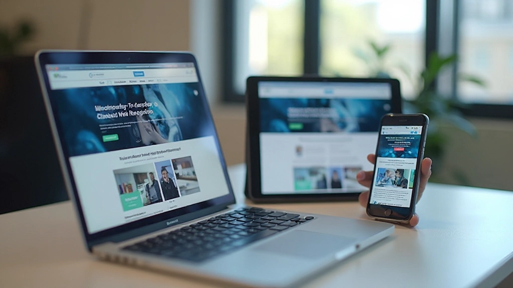
A practical breakdown of how media queries work, where to set your breakpoints, and common patterns that work well for most projects without overcomplicating things.
Read the guide
Why mobile users care about speed, practical techniques to improve load times, and how testing on real devices reveals performance issues you’d miss in the browser.
Read the guideLook at how you’re currently building sites. Are you designing desktop-first and shrinking things down? That’s a common starting point. Understanding where you are helps you move forward.
Media queries, flexbox, CSS Grid, responsive images — these aren’t optional skills anymore. Invest time in understanding how they work. The learning curve isn’t steep if you take it step by step.
Don’t overhaul your entire workflow at once. Pick a small project. Build it mobile-first. Notice what changes. The real learning happens when you actually build, not just when you read about it.
Your laptop isn’t a mobile phone. Browsers have lied to you about performance. Test on actual devices with actual networks. You’ll find issues your browser never showed you.
Mobile-first design isn’t a destination. It’s a mindset. You’ll keep learning. New techniques emerge. User behaviors change. Stay curious and keep refining your approach.
“I was skeptical at first, honestly. But after I built my first mobile-first site, I couldn’t go back. The whole design process just feels cleaner. Decisions are easier when you’re working within constraints.”
— Maya, UI Designer
“Our mobile conversion rates went up after we switched to mobile-first. It’s not magic — we just started actually thinking about what our mobile users needed instead of assuming they wanted a shrunk-down desktop site.”
— Raj, Product Manager
“The learning curve was real, but it wasn’t as steep as I expected. Once I got the mindset shift, responsive design made way more sense. Now when I see desktop-first code, I cringe a little.”
— Sofia, Frontend Developer
Start thinking mobile-first today. It’s not a trend — it’s how modern web design works. We’re here to help you understand the strategies, implement the techniques, and build better websites.
Get Started