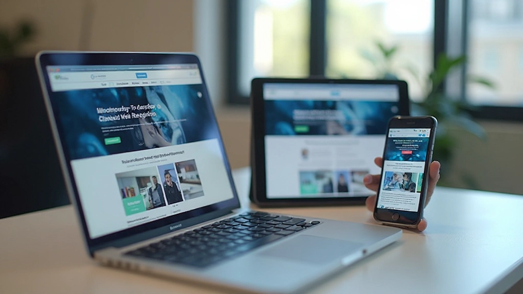
Starting With Mobile: Why It Actually Changes Everything
Design for the smallest screen first, and suddenly your entire approach to layout, content, and functionality shifts. Here’s why that constraint is actually your greatest advantage.

Why Mobile-First Isn’t Just About Phones
There’s a fundamental truth in web design that most people discover the hard way: designing for mobile first forces you to make better decisions. Not better for mobile users alone — better for everyone.
When you start with a 320px viewport, you can’t hide behind clever layouts or excessive content. You’re forced to prioritize ruthlessly. What’s actually important? What can users live without? These aren’t comfortable questions, but they lead to stronger designs across all screen sizes.
This isn’t about fitting your desktop design onto phones. It’s about building from the constraint upward, letting the mobile experience inform and improve your entire product.


The Constraint Creates Clarity
Constraints aren’t limitations — they’re creative tools. When you design for 375px width (iPhone SE), every pixel matters. There’s no room for decorative sidebars, massive hero images, or multi-column layouts. You get down to the essentials.
This clarity carries through to everything. Your typography becomes more intentional. Your spacing more deliberate. Your content hierarchy more obvious. Users on desktop benefit because you’ve already figured out what actually needs to be there.
The real win: When you remove unnecessary elements for mobile, they stay gone. Your desktop design becomes a natural expansion of mobile — not a completely different experience.
How Mobile-First Actually Works in Practice
The methodology isn’t complicated, but it does require a different mindset. Here’s the actual workflow.
Design for 375px first
Start with a single column. No sidebars, no fancy multi-column grids. Just content flowing top to bottom. This viewport size covers most smartphones and forces you to think linearly.
Expand methodically at breakpoints
Move to tablet (768px), then desktop (1024px+). At each breakpoint, ask: what can I improve now that I have more space? This is when sidebars, two-column layouts, and expanded navigation make sense.
Test ruthlessly on actual devices
Don’t rely on browser preview. Test on real phones, tablets, and monitors. You’ll catch issues that simulators miss — tap target sizing, scrolling behavior, image rendering at different resolutions.
What You Actually Gain From This Approach
Beyond the philosophical benefits, mobile-first design delivers concrete practical advantages. Your website loads faster because you’re not bloating the mobile version with desktop assets. Your code stays cleaner because you’re adding features progressively rather than hiding them.
Performance improves naturally. You’re thinking about bandwidth from day one. Image optimization becomes essential, not an afterthought. CSS becomes leaner because you’re building up, not tearing down.
And here’s the thing: your mobile users aren’t a secondary audience anymore. They’re your primary users. That mindset shift matters. You’re not retrofitting an experience — you’re building the right experience from the ground up.

Getting Started: Practical First Steps
You don’t need to overhaul your entire workflow. These changes integrate gradually.
Start with your next project
Don’t retrofit existing sites immediately. Your next design? Start mobile-first. Open your design tool and set your artboard to 375px. Work from there. You’ll feel the difference within the first hour.
Use mobile-first CSS
Write your base styles for mobile, then use min-width media queries to expand. It’s cleaner, it’s faster, and it forces you to think progressively. Tools like Tailwind make this pattern easier than ever.
Test on real devices immediately
Get your design on actual phones as soon as possible. Use Chrome DevTools for quick checks, but validate on real hardware. What looks good at 375px in the browser might feel different in your hand.
Mobile-First Isn’t a Trend — It’s Just Better Design
Mobile-first design gets talked about like it’s a special technique, but it’s really just good thinking applied systematically. You’re starting with constraints that force clarity. You’re prioritizing ruthlessly. You’re building up instead of cutting down.
The result? Websites that work beautifully on phones, tablets, and desktops. Designs that load faster. Code that’s easier to maintain. And most importantly, users who have a genuinely good experience, regardless of what device they’re using.
If you haven’t tried mobile-first design yet, your next project is waiting. Start at 375px. Build from there. You’ll understand why this approach has become the standard.
This article provides educational information about mobile-first web design principles and methodologies. Specific implementation approaches may vary depending on your project requirements, team skills, and business objectives. While these principles are widely adopted in the industry, always evaluate them within the context of your particular situation. For complex projects, consider consulting with experienced web design professionals.


